< CustomInput /> .
Developer's Guide

1 of 9
Usage
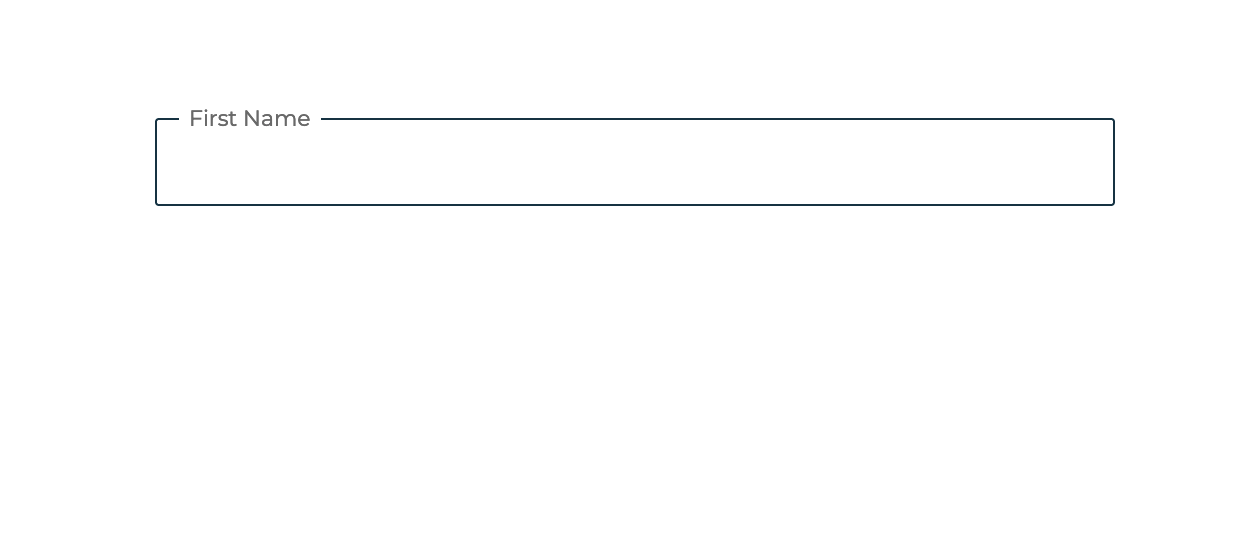
Basic input
Basic usage of custom input
Show code
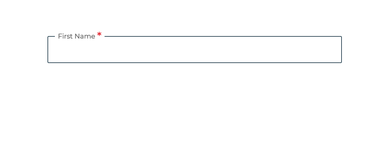
Validated
Validated usage of regular text feild.
Show code
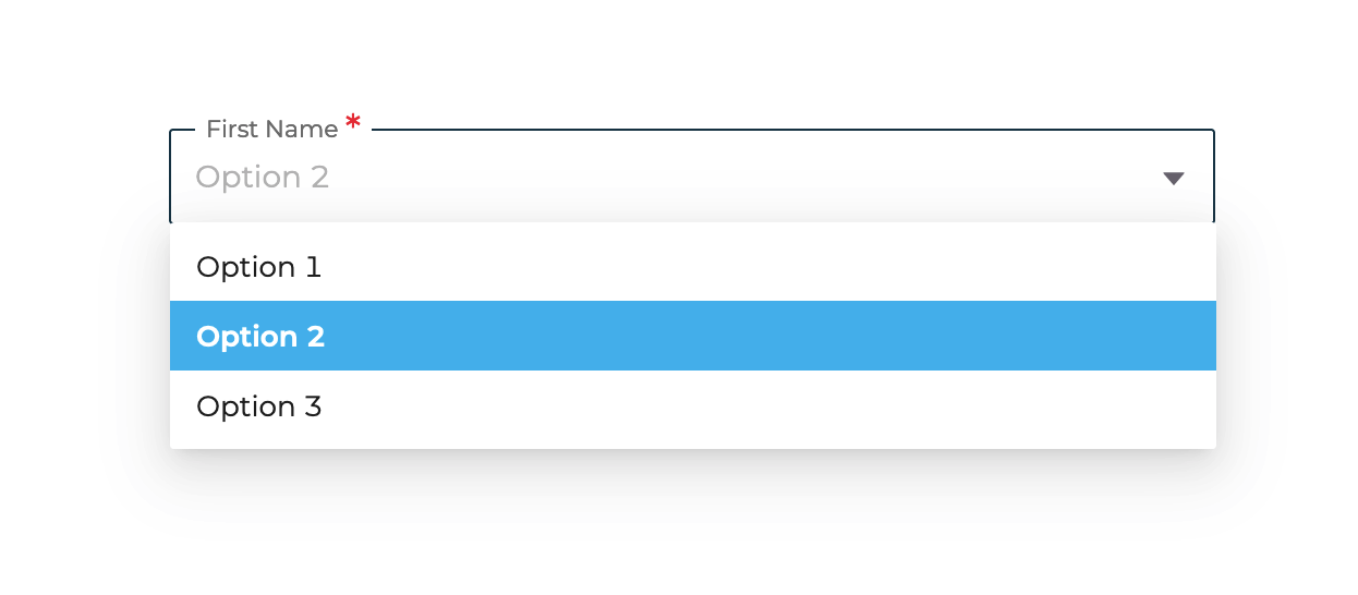
Dropdown selector
For selecting an option out of multiple options. by default, all dropdowns have been set to be searchable.
Show code
Flagged dropdowns
Dropdown selector displayed with corresponding flags
Show code
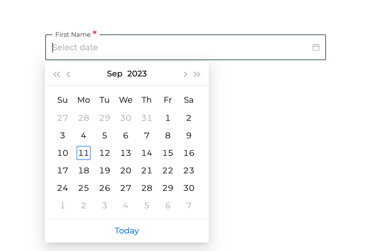
Date picker
Used to select a date from calendar.
please note that the initial value for date must be converted into a moment format
Show code
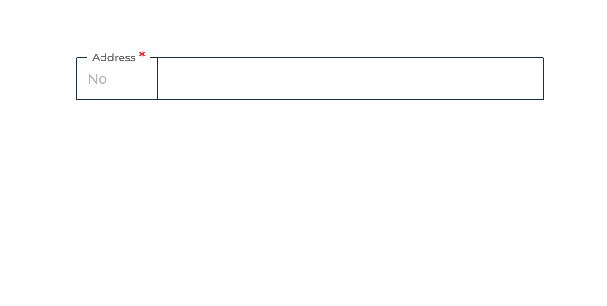
Space compacted
use for addresses.
Show code
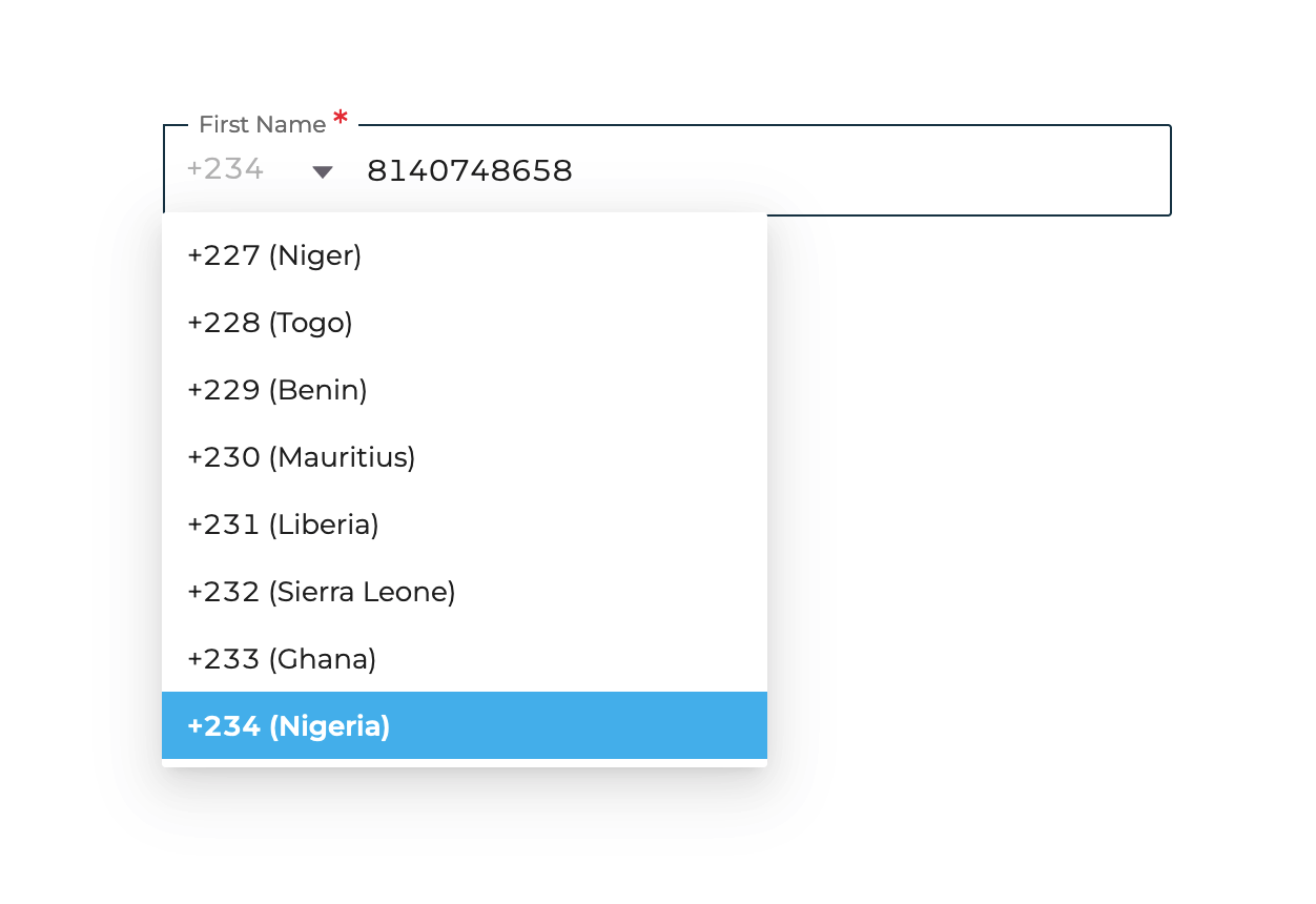
Phone Number
usage of custom input for phone numbers
Show code
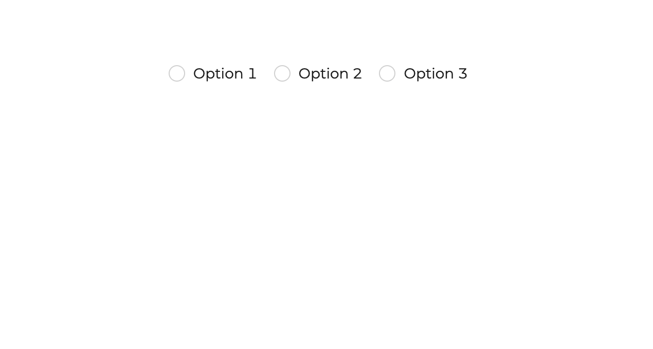
Radio buttons
For selecting an option out of multiple options. by default, all dropdowns have been set to be searchable.
Show code
Subtitled
Adding subtitles just below your custom input
Show code